
March 2023 – Now
In early 2023, RBC's ecosystem of products faced significant challenges in maintaining a unified design language. There were lots of unstructured, local UI kits, a lack of components documentation, and inconsistent design elements across different products. To address these issues, I took on the role of facilitator within the Product Design team, focusing on improving the Design System
10 Product Designers
20+ Developers
8 Product Managers
4 Project Managers
1 UX Researcher
All Figma files and the components in Design System or UI Kits weren’t organised. There were no proper navigation system and documentation in Design System, its files and Figma files for RBCs’ products
The Design System development at RBC faced challenges due to unregulated processes. There weren't clear guidelines or standard workflows
Designers struggled using colors in Design System, because two existing palettes were absolutely the same, but with different namings. E.g. Background Primary in App and Background-01 in Web Design System
Working process
When I joined the Product Design team, I've dived deep into the Design System processes, examined Figma files structure, component base and collaboration workflow with developers
At the beginning of work I've initiated a weekly call with Produc Designes, Communication Designers, HR BP, Design Operations and monthly call with Head of Design Department. Through these sessions, I gathered initial insights into the current Design System workflow and identified key pain points and problems affecting its effectiveness
Collaboration with HR BP and Design Operations
Collaboration with Head of Design Department
Collaboration with Product Managers
Collaboration with Product Designers
From now on, the Design System is called Waves and has its own key visual. Waves Design System consists of several structured Kits: Web Kit, App Kit, Variables Kit, Email Kit and Service Kit
Waves is a Base Design System. It includes most commonly used documented components across all the RBC's products. For example, Input is similar in all RBCs’ products and as a component is located in Base Design System

Figma covers for Waves Design System files
All RBC products (e.g. RBC Investment, RBC Life) now have its own teams. They have a unified projects’ structure: Web, App, Communication (all communication designers team files), Email (product’s marketing email staff), Archive
Design System team consists of several teams: Base (Waves files), Communication (Kits of communication team), Library (tone of voice, Figma files structure, product communication), Archive

Unified Figma anatomy
I’ve managed to design a key visual for Design System’s navigation helping all key Stakeholders (Developers, Designers, Managers) find design components faster
All components’ previews are divided into semantic groups. Each group has its own color identification and description
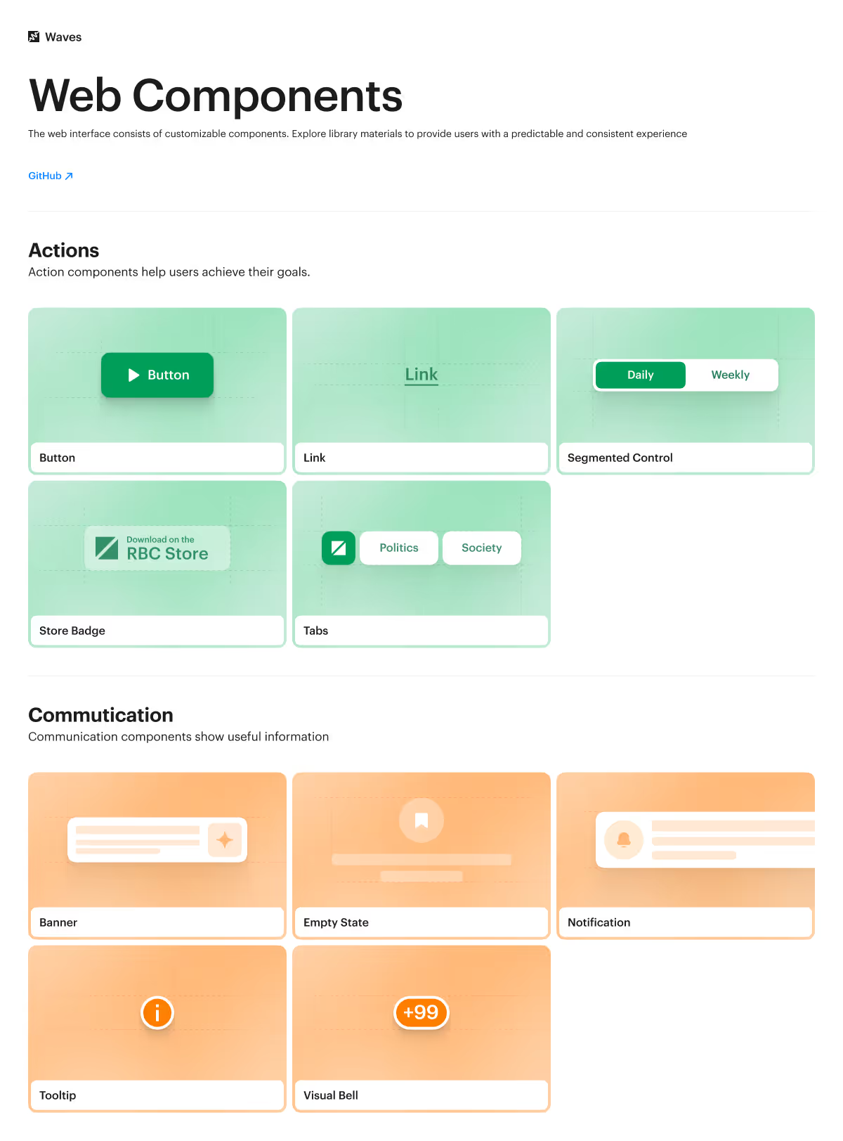
Web components navigation
I've managed to introduce semantic Color Variables to RBC's Design System and recolour all the layouts in Figma. Is’t much easier to convert Light theme to Dark in a few clicks
From now on, Designers no longer have any confusion while using color palettes. Each color Variable has a description documenting cases of color usage in products

Color Variables and its descriptions

Color Variables and its descriptions
I’ve manage to design a template for adding documentation to each component of our Design System. From now on, it’s easy to find each components in Storybook and get to know it without additional communication between Stakeholders
Designers may onboard themselves in the Design System easier and faster
Button component overview
At this stage, together with Developers and key Product Stakeholders, on a weekly calls I prioritised which product components needed to be updated and developed first
Collaboration with Product Managers
Collaboration with Developers Team
Defining problems
Value vs Effort prioritisation

Button component documentation
I led a design audit (review) of the developed components across each product, with my Product Designers reviewing the implemented components within their products
Reduced by 20%. Managers and Designers don’t waste a lot of time for additional communication about Design System components, because with clear documentation developers ask much less questions
Increased by 40% according to the survey of HR BP among Designers, Product Managers and Developers
Reduced by 30% for Product Designers and Product Design Lead
Reduced by 30%. Designers convert Light mode to Dark mode in two clicks and navigate within Design System faster

Design System Agenda for weekly calls with Product Design team
Waves Design System logo
With a single component Deisgn System, I want to scale it to all RBC products and automate the process of implementing new components to the Storybook database